
Featured Artist: Donya Todd

This month, we look at Donya Todd’s work – an explosion of colour, featuring a riot of wonder-women and skulls and rainbows. We loved it the moment we set eyes on it. Editor Caroline Icke got in touch with Donya to chat about the evolution of her style, what inspires her work, and what it was like to team up with The Word Factory and Guillemot Press on its latest project.
DONYA, LET’S START FROM THE BEGINNING! HOW/WHEN DID YOU GET INTO ART? DESCRIBE YOUR STYLE FOR US. HAS IT EVOLVED SINCE YOU STARTED?
I got my first gig in primary school helping a local artist paint Noah’s Ark in the food room. Shortly afterwards, I won a circle drawing competition in maths class, and another painting ponies on Dartmoor. Art was fun and I was good at it.
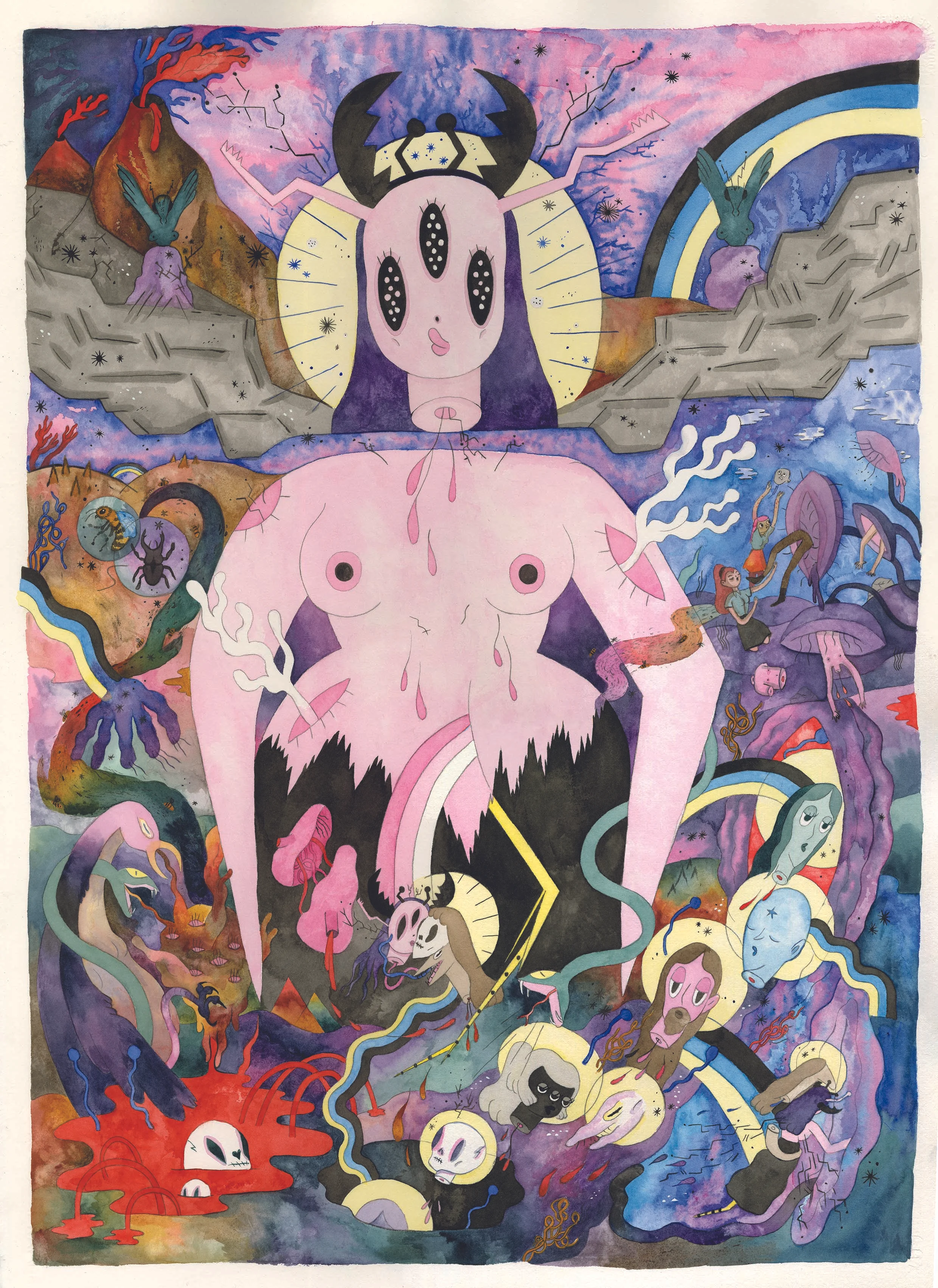
I would describe my practice as a weirdscape: magical girls running wild in a glittery, skull-infested wasteland. Romantic apocalypses under an irradiated, rainbow sky.
I’m still drawing ponies and shapes and quasi-religious imagery, these are the building blocks of my personal mythology. Illustration is a constant state of transformation, the work flowers and dies and changes shape into something new and weird and good – but those symbols remain throughout.
WHAT INSPIRES YOU TO START A NEW PIECE OF WORK? DO YOU HAVE A CLEAR IMAGE IN MIND BEFORE YOU START CREATING?
Sometimes an idea begins with a drawing, other times a story or a word. I will usually have a volcanic period of sketchbook work – getting everything as it should be visually and textually before launching into the final object. That could be days, that could be years. It is usually a book. These bookworlds have a mind of their own and I am often surprised by the journey. I usually know how it will end before I start, and the endings are always bittersweet.
YOU RECENTLY TEAMED UP WITH THE WORD FACTORY AND GUILLEMOT PRESS TO ILLUSTRATE FOUR UPCOMING SHORT STORY PAMPHLETS, WRITTEN BY FOUR AWARD-WINNING WRITERS. HOW DID YOU RESPOND TO EACH STORY?
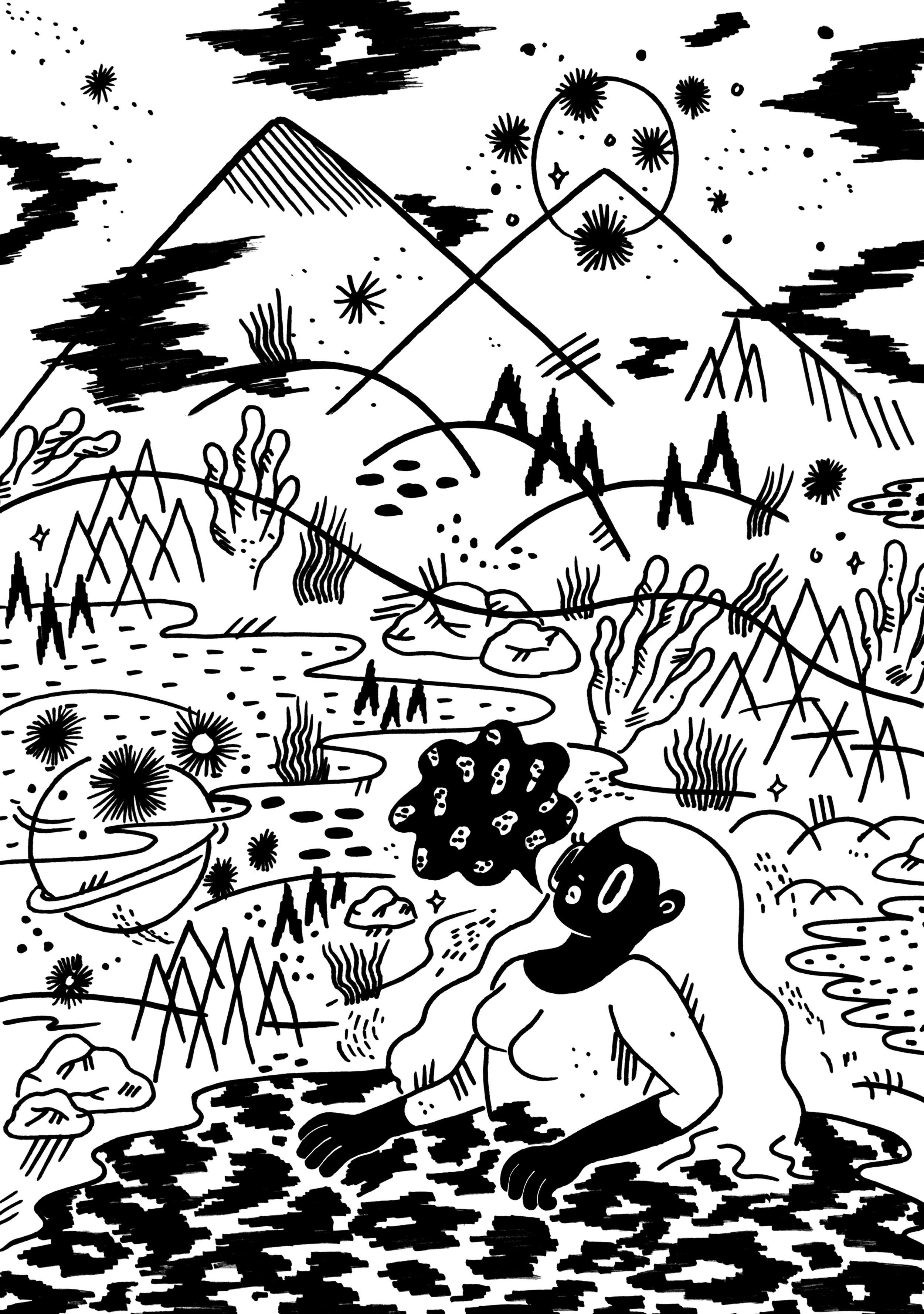
The brilliant Guillemot Factory stories are brutal things – each in a different way. It was my job to bring the four together visually, but thematically they all have this doomy atmosphere, a sense of ending.
I used black and white watercolour to enhance the emotion of the texts, illustrating poetically rather than literally. Once I figured out the style it was a case of manically producing artwork, an explosive output. It was a real pleasure to work this way as I had lots of exciting material to draw on, and the books look wonderful.


YOU ALSO CREATE COMIC BOOKS FEATURING ‘FOUL-MOUTHED GIRLS, FRENCH BOYS AND FRIED CHICKEN’ – AND THEY’RE PRETTY AWESOME! WHAT DREW YOU TO COMICS?
I started making comics and zines as a way to tell stories. My big break was with Blankslatebooks who liked my scrappy zines and made me a graphic novelist. Comics are a way of animating still imagery. You can squeeze so much life into comic panels and those characters and that world comes alive. I have taken a two-year break from making comics to focus on my Masters degree as they are very time intensive – but I don’t think I could ever not make them in some capacity.
YOU USE A LOT OF EXPLOSIVE, EXPRESSIVE COLOUR IN YOUR ARTWORK – WOULD YOU SAY YOU EXPERIENCE SYNAESTHESIA? DO YOU HAVE A FAVOURITE COLOUR TO WORK WITH?
Colour for me is a purely visual stimulation – I derive pleasure from unrestrained colouring in my practice and love to find new combinations whilst painting. It can be greatly affected by the mood of the narrative, but for the most part it is an intuitive practice – evolved through both physical and digital experimentation. Pink. Pink, purple and three different types of blue for infinite effects. The Guillemot books are almost entirely black and white and I’ve come out of it and back to colour with an appreciation of carefully considered tonal qualities. I wouldn’t say I’m more restrained, but I am making far less mistakes with my colour choices.
YOU’VE WRITTEN AND ILLUSTRATED A BOOK OF POETRY, TAKING SHAPE. WHAT COMES FIRST, THE WRITING OR THE ILLUSTRATIONS?
The writing came first with Taking Shape. It’s an experimental piece blending original creative writing with black-out poetry. I had a theme: End of the World. A book: Christian Theology, and a head/heart full of the life-changing scenery of Iceland. Taking Shape is a translation of all those thoughts and feelings into something romantic and doomed and beautiful. Making this book was an opening up of my practice into weird poetics, which I am really enjoying, and which is evolving with my changing life and practice.

FINALLY, CAN YOU TELL US A LITTLE ABOUT WHAT YOU’RE WORKING ON RIGHT NOW?
I’ve just finished my new book VENUS. VENUS is four A1 paintings depicting the narrative of the Insect angel Princess Hymen. Summoned from an egg by the poet saint of the future, Hymen and the horse fall in love, travel through the void and destroy the Antichrist together. It’s a love poem in four parts, illustrated using segments of the giant paintings. It is my best/weirdest project yet. It won me the Outstanding Achievement Award at my Masters exhibition in Falmouth, and I’m hoping to exhibit the art and get the book published elsewhere in the near future.
Sat 15 Oct: LAUNCH OF THE GUILLEMOT FACTORy
A chance to celebrate the London launch of the exclusive new Word Factory illustrated imprint, The Guillemot Factory – a new publishing venture in collaboration with The Guillemot Press. Immerse yourself in a day of activities with the imprint’s authors and hear their work in an evening salon with Jessie Greengrass, Adam Marek and David Constantine. Book your place here.